I recently watched “Buy More”—a compelling documentary that unpacks the tricks brands use to keep their customers consuming online. The documentary, though subversive, got me thinking about the critical role that data science plays in every interaction on the web and how we leverage these insights for our clients.
In the last year, the importance of focusing on user experience (UX) has reached fever pitch in terms of driving conversions. With 2024 in our wake, I thought it apropos to write about five of the key UX elements that can significantly improve your online store’s performance in 2025.
In this article I’ll discuss content and commerce, CTA best practices, improving your conversion funnel, fast and frictionless checkout, and the importance of social proof. Let’s dive in.
Content and commerce
Content has always been king, but in 2025, AI will play a key role hyper-personalized content recommendations.
Picture this: you’re browsing a product detail page for a jacket. AI already knows your browsing history, remembers you often gravitate towards blue tones, and has noticed you look at eco-friendly options. As you scroll, dynamic suggestions for other eco-friendly blue jackets are displayed, and at the end you’re fed blog posts about the latest trends in eco-friendly clothing. Before you checkout, a curated selection of accessories will display based on users who have similar browsing data. The more relevant the content, the more likely you are to make a purchase.
Shopify and Optimizely are using AI to create hyper-personalized shopping experiences. Shopify focuses on automating product recommendations, email content, and search, while Optimizely enhances personalization with predictive analytics and AI-driven testing.
Great! That all sounds fantastic, but to reference Apple’s philosophy, if a something isn’t well-designed in terms of both form and function, it risks failing to connect with users. Enter: User Experience (UX).
The first step in any UX endeavor is to understand your users. It’s crucial to know how they interact with every page, every piece of content, every call-to-action.
“You’ve got to start with the customer experience and work backwards for the technology. You can’t start with the technology and try to figure out where you’re going to try to sell it.”
—Steve Jobs
If a client doesn’t have the ability to do extensive user testing and qualitative research (like screen recordings, card sorting or surveys), we can rely on good ‘ol best practice based on years of user research.
I’ve gathered a few examples based on our own experience at BlueBolt:
User’s don’t read—they scan. Redesigning a long paragraph into a single sentence with bullet points, or better yet, an animation, can go a long way in retaining users’ attention.
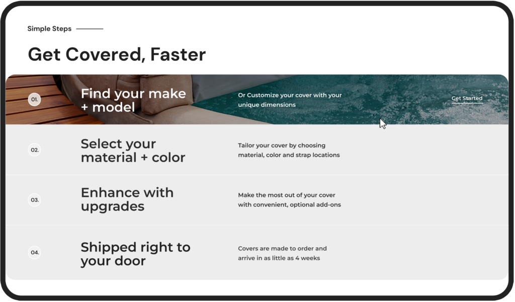
- In this example from our client The Cover Guy, the section is twofold—the user can gain information about the process while being delighted by the hover animation that encourages them to get started.
- This is an “evergreen” rule that will continue through 2025 and beyond.
Users scan content left to right, and they also have a propensity to best remember the first and last items in a series, known as the Serial Position Effect.
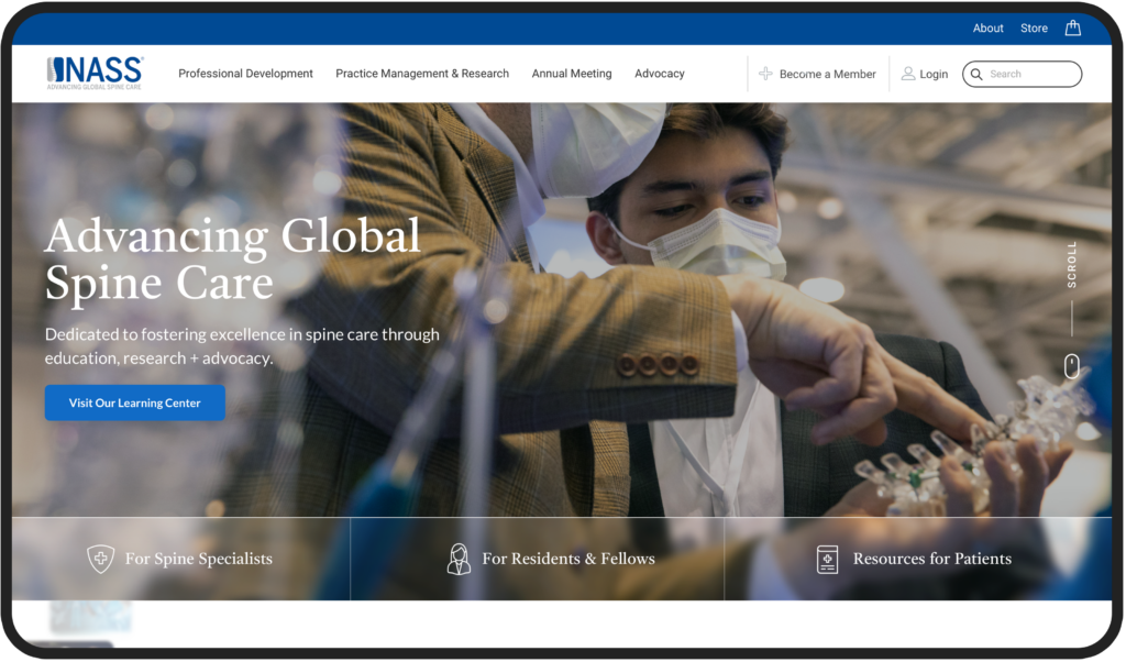
- Knowing this, we designed NASS’s hero to focus first on the USP (unique selling proposition), and then invited them to scroll. The navigation to focus on the #1 item users are looking for (Professional Development), and last—search—as 69% of users these days these days go directly to search upon arrival.
Blending content with commerce is a key strategy for engaging users. People want to feel connected with a brand, feel themselves reflected in it, to feel a sense of community. Blog posts, educational content, storytelling, and social media are all meaningful ways of connecting with your users.
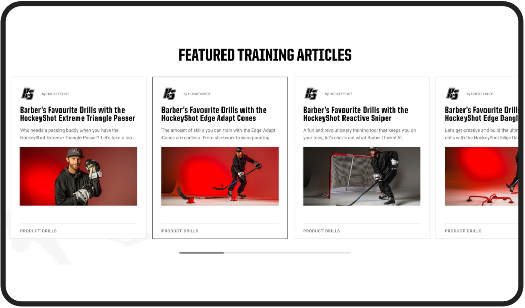
- In this example from our client HockeyShot, we implemented a ‘Training Academy’ on the website, allowing users to access articles from professional athletes, discover specific drills, skills, or programs that align with their interests, and foster a sense of community, while subtly integrating products within the content.
Calls-to-Action
Creating call-to-action buttons on a website may seem like a simple endeavor. Yet, you might be surprised by the amount of effort major brands like Walmart and Amazon invest in perfecting their calls to action. Big brands respond to and adjust their site experience to consumers depending on their unique behavior (new vs. returning user), preferences (green or light green?), and intent (I’m here to learn vs. here to buy). This may mean adding rule-based targeting with different messages on their CTAs based on unique customer journeys, like new vs. returning users. For example, a CTA button would read “Welcome Back! Continue Shopping” vs. “Get Started”.
Gone are the days where buttons are ambiguous (think “Learn More”) or stale (“Download Now”). “Download Now” may be direct, while “Get Your Free Guide Today” adds value by explicitly mentioning the benefit. Second, action words like “Get,” “Discover,” and “Start” often lead to higher engagement.
On top of that, I like to use a simple “squint test” to see if a CTA stands out from the other “noise” on the page. Just like it sounds, if you squint, is the eye naturally drawn to the CTA? If not, it’s time to adjust the visual hierarchy.
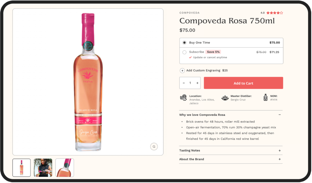
- In Sip Tequila, the CTA passes the squint test as the eye is naturally drawn to the CTA.
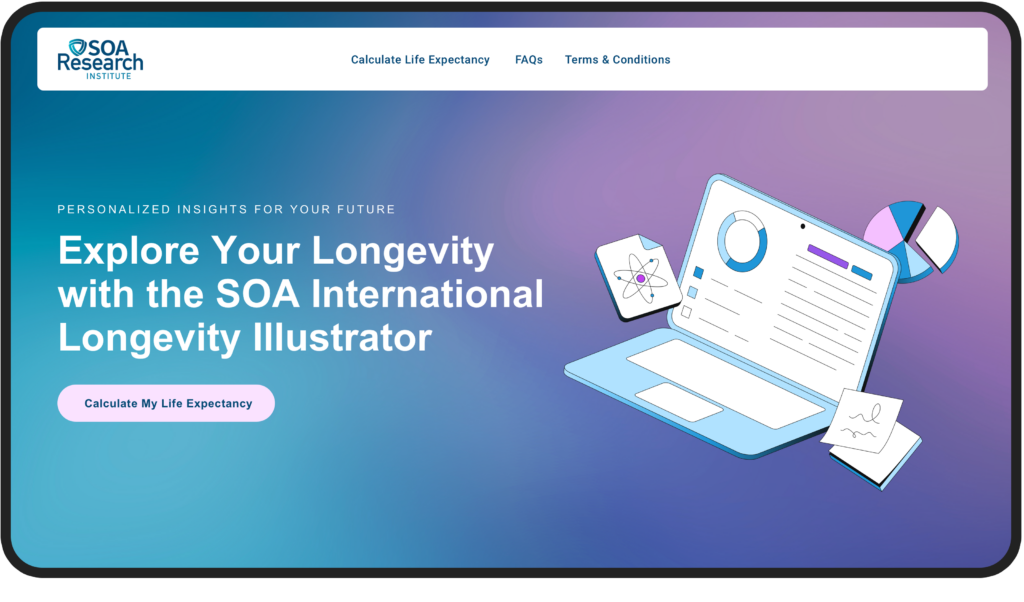
- In SOA, the CTAs are clear and descriptive.
Analyze the Funnel
During the discovery and UX phase, BlueBolt carefully examines the paths users take on the website. We analyze each segment and ask key questions like: What are the top landing pages on your site? What channels to they come from (e.g., organic search, paid ads, social media, email)? What elements do users interact with prior to purchase? Is mobile optimized? Does a user receive follow-up communication after checkout? This allows us to map out the user journey and spot any roadblocks that might be causing problems along the way.

Here are some typical metrics to focus on:
- Page load speed
- Content relevance
- Effective CTAs
- Engagement rate
- Click-through-rate
- Average Order Value
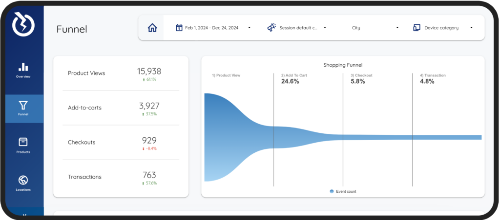
- In BlueBolt’s Looker Studio Report, clients can visualize their data in a report customized to fit their unique requirements.
Fast and Frictionless Checkout
As Martin LeBlanc from Freepic puts it, “Good user experience is like a joke—if you have to explain it, it’s not very good.” This idea is particularly relevant when designing your checkout process.
In UX, BlueBolt focuses on streamlining the checkout steps, simplifying forms, and minimizing distractions, as a fast and frictionless checkout keeps users focused and reduces the likelihood of cart abandonment.
It’s no surprise that Amazon introduced one-click checkout—speed is everything. Returning customers don’t want to waste time re-entering their information. They expect a seamless, hassle-free experience, which leaves them with a positive impression of the brand.
—Antoine de Saint-Exupéry
“Perfection is achieved, not when there is nothing more to add, but when there is nothing left to take away.”
The average checkout process on eCommerce sites spans 5.08 steps. Knowing this, BlueBolt focuses on clear instructions, multiple payment options, and progress indicators help users move quickly through the process without confusion.
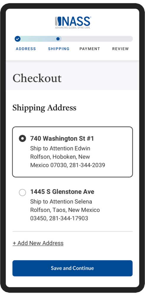
- Nass’s mobile design includes a beautiful progress bar to provide a clear visual indication of how far along the user is in the process.
Importance of Social Proof
We, the consumers, are naturally inclined to distrust company jargon and advertising, but we tend to trust the opinions of real users who have experienced the product firsthand. I know I do. It’s interesting that 99% of users look for reviews when they shop online as well. At BlueBolt, we’ve seen firsthand how essential social proof is in driving conversions and building trust. In our recent projects, we’ve made it a priority to incorporate customer reviews, ratings, and real-time notifications showing recent purchases. By doing this, we’re creating a sense of credibility and community around the brands we work with. It’s what the users want.
This strategy has been particularly effective in reducing hesitation and boosting conversions, especially in today’s market, where consumers are more discerning and trust-driven than ever.

As we head into 2025, it’s clear that creating a seamless and engaging user experience is no longer optional—it’s essential for driving conversions and building lasting customer relationships. By blending personalized content with commerce, perfecting call-to-actions, analyzing the user journey, streamlining checkout, and leveraging social proof, you can significantly boost your online store’s performance. At BlueBolt, we focus on these key UX elements to help our clients stay ahead of the game, and we’re excited to keep pushing the envelope next year.


